Plotting
The plotting interface on streamz DataFrame and Series objects attempts to mirror the pandas plotting API, but instead of plotting with matplotlib uses HoloViews to generate dynamically streaming bokeh plots. To support plotting streaming data you can use this interface either in a Jupyter notebook or deploy it as a bokeh server app.
HoloViews provides several constructs which make it well suited to
streaming visualizations. All plotting methods will return so called
DynamicMap objects, which update the plot whenever streamz
triggers an event. For additional information about working and
plotting with HoloViews see the User Guide, as we will focus on
using the high-level plotting API in this overview and skip most of
the mechanics going on behind the scenes.
All plots generated by the streamz plotting interface dynamically stream data, since the documentation cannot easily embed streaming plots all plots represent static screenshots.
Basic plotting
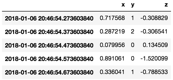
Throughout this section we will be using the Random construct,
which provides an easy way of generating a DataFrame of random
streaming data.
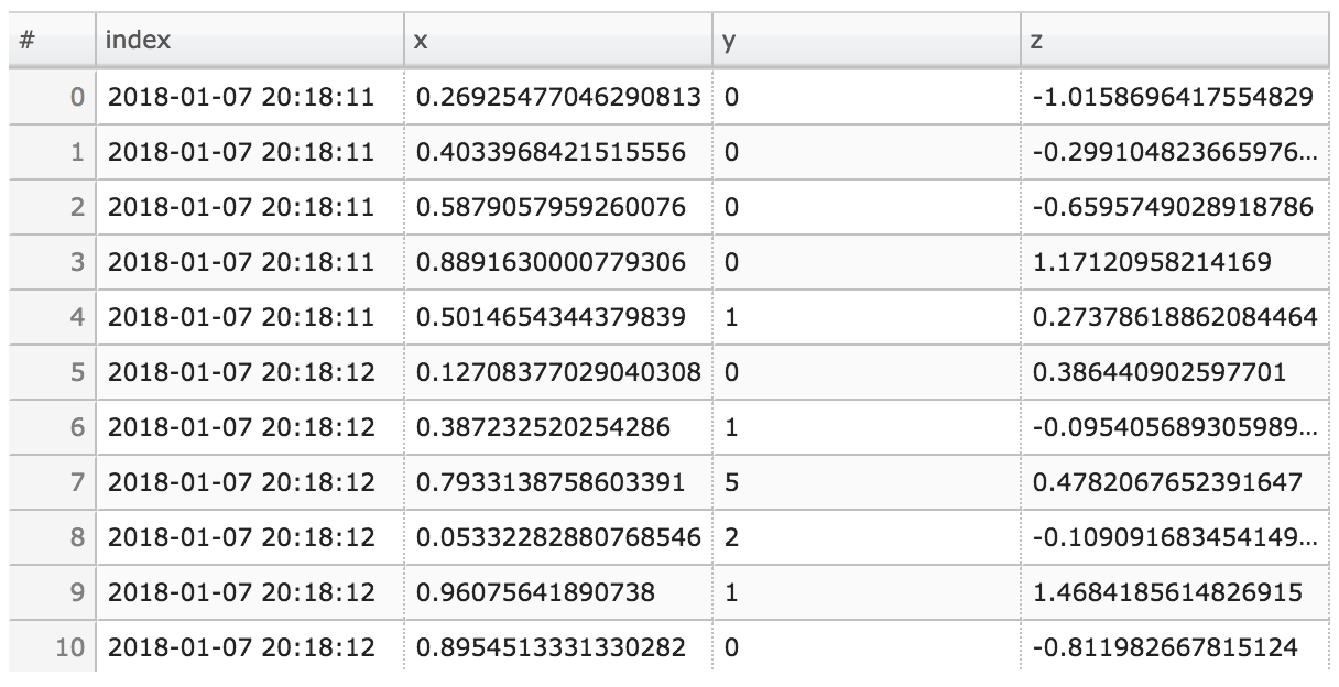
from streamz.dataframe import Random
df = Random()
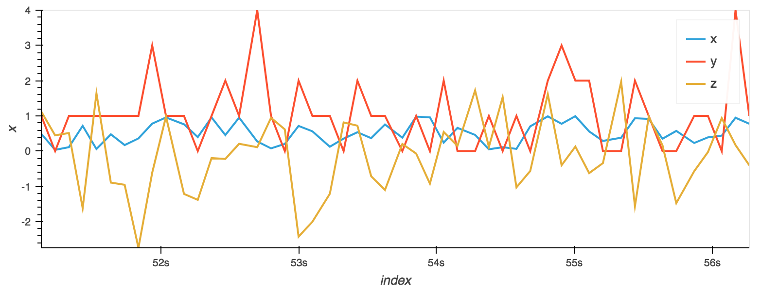
The plot method on Series and DataFrame is a simple wrapper around a line plot, which will plot all columns:
df.plot()
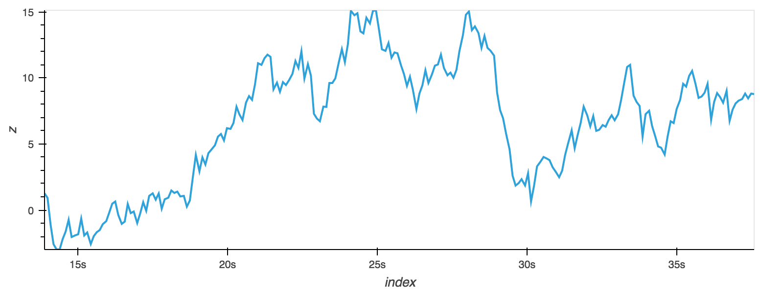
The plot method can also be called on a Series, plotting a specific column:
df.z.cumsum().plot()
Another more general way to express the same thing is to explicitly
define x and y in the DataFrame plot method:
df.cumsum().plot(x='index', y='z')
Other plots
Plotting methods allow for a handful of plot styles other than the
default Line plot. These methods can be provided as the kind
keyword argument to plot().
These include:
- ‘bar’ or ‘barh’ for bar plots
- ‘hist’ for histogram
- ‘box’ for boxplot
- ‘kde’ or
'density'for density plots - ‘area’ for area plots
- ‘scatter’ for scatter plots
- ‘table’ for tables
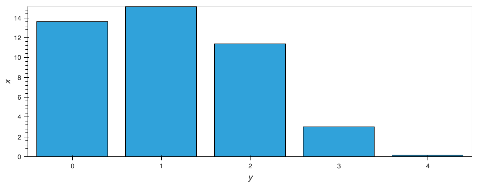
For example, a bar plot can be created the following way:
df.groupby('y').x.sum().plot(kind='bar')
You can also create these other plots using the methods
DataFrame.plot.<kind> instead of providing the kind keyword
argument. This makes it easier to discover plot methods and the
specific arguments they use:
In [14]: df = Random()

In [15]: df.plot.<TAB>
df.plot.area     df.plot.barh     df.plot.density   df.plot.kde    df.plot.scatter
df.plot.bar      df.plot.box      df.plot.hist      df.plot.line   df.plot.table
Bar plots
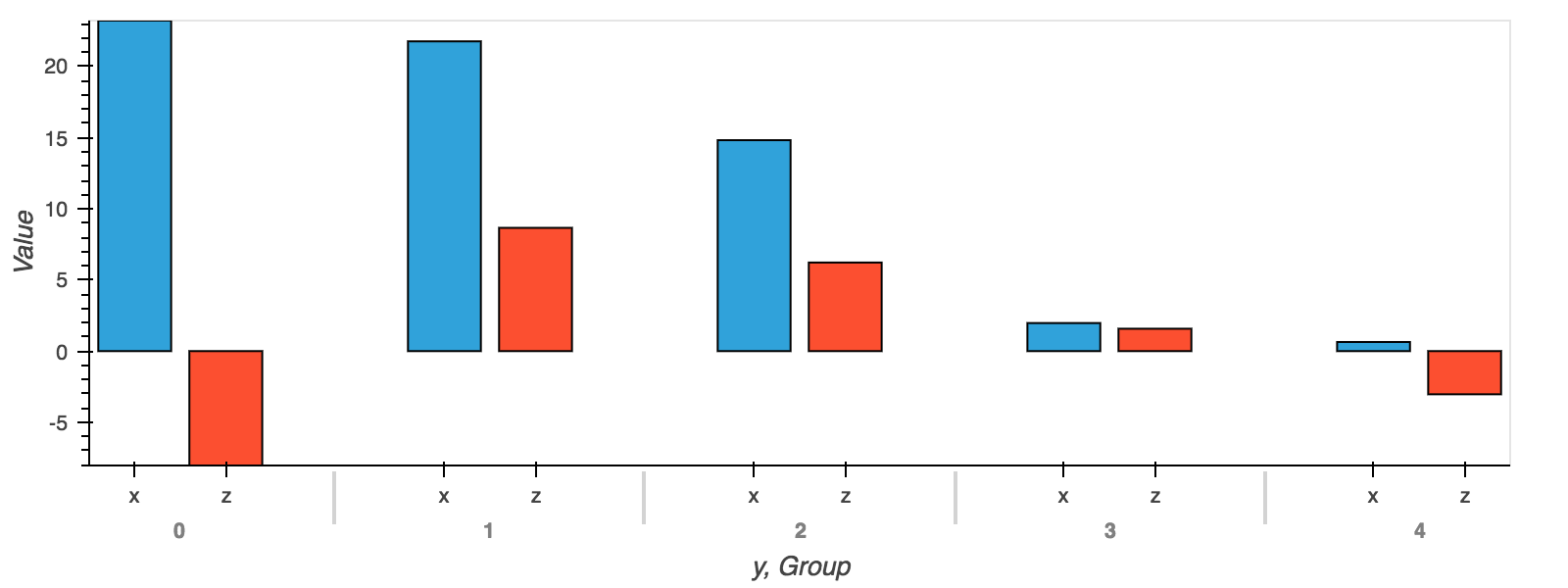
For labeled, non-time series data, you may wish to produce a bar plot. In addition to the simple bar plot shown above we can also produce grouped bars:
df.groupby('y').sum().plot.bar(x='y')
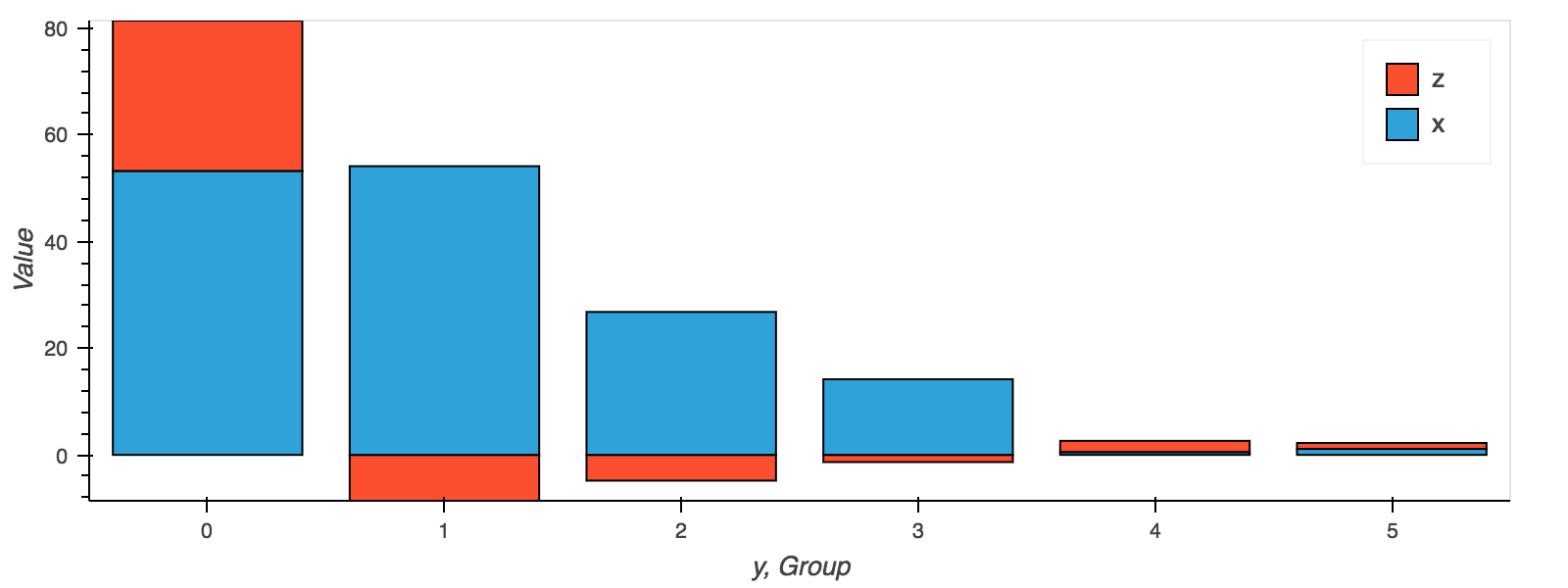
Alternatively you may also stack the bars:
df.groupby('y').sum().plot.bar(x='y', stacked=True)
Histograms
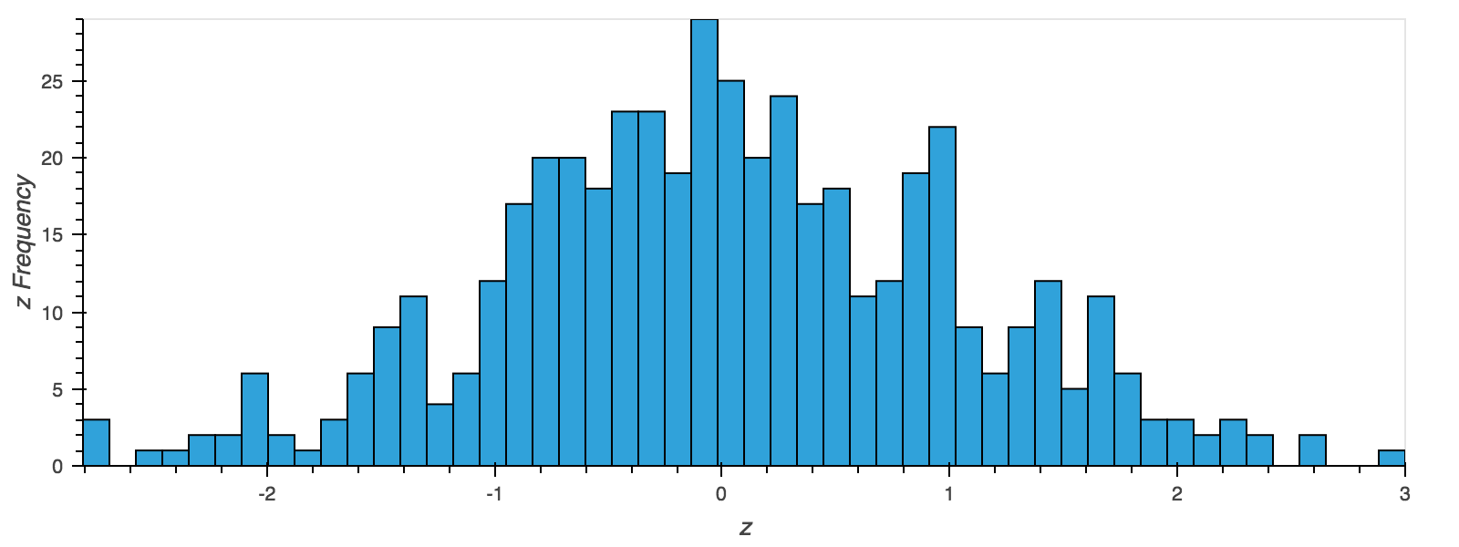
Histogram can be drawn by using the DataFrame.plot.hist() and Series.plot.hist() methods. The number of bins can be declared using the bins keyword and normalization can be disabled with the normed keyword.
df.z.plot.hist(bins=50, backlog=5000, normed=False)
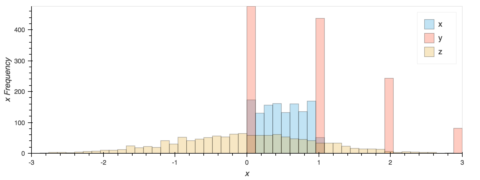
Calling from the DataFrame.plot.hist will plot all columns, to be able to compare you can lower the alpha and define a bin_range:
df.plot.hist(bin_range=(-3, 3), bins=50, backlog=5000, alpha=0.3)
Box Plots
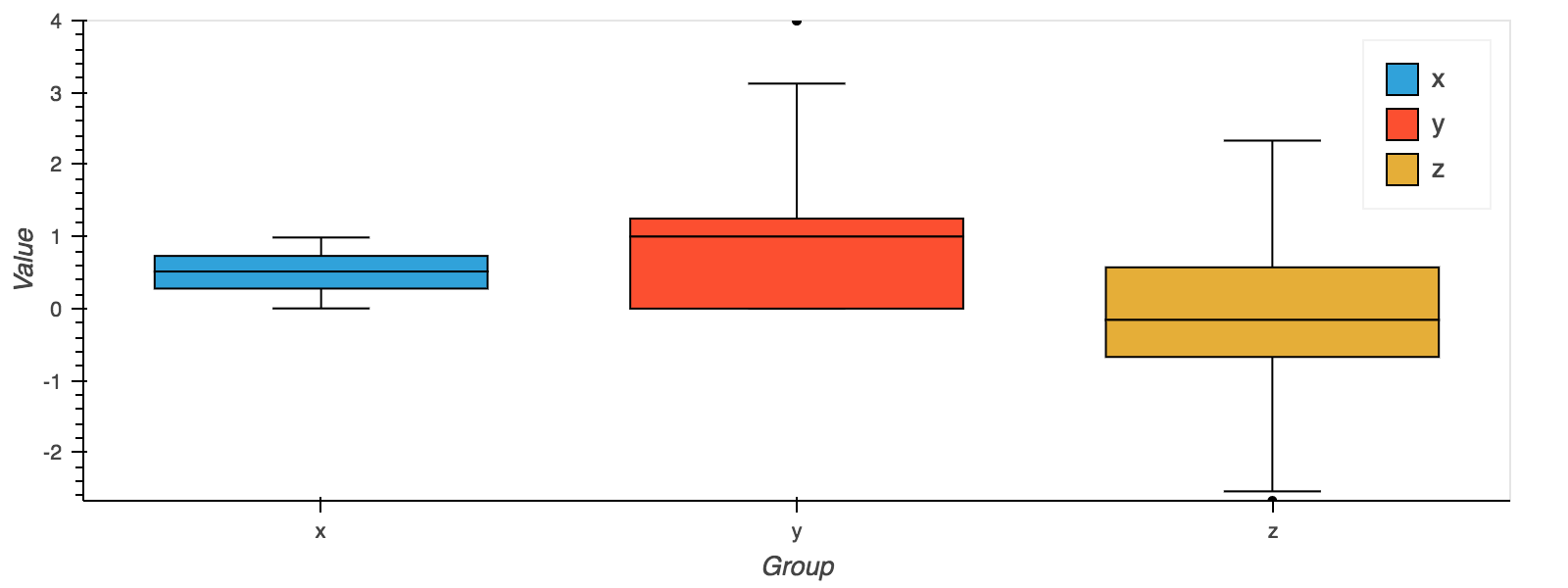
Boxplot can be drawn calling Series.plot.box() and DataFrame.plot.box() to visualize the distribution of values within each column.
For example here we plot each column:
df.plot.box()
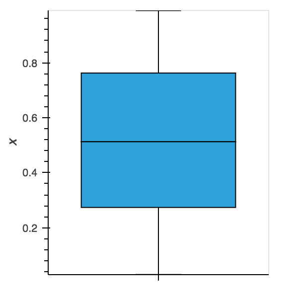
Or we can generate a boxplot of a Series:
df.x.plot.box(width=300)
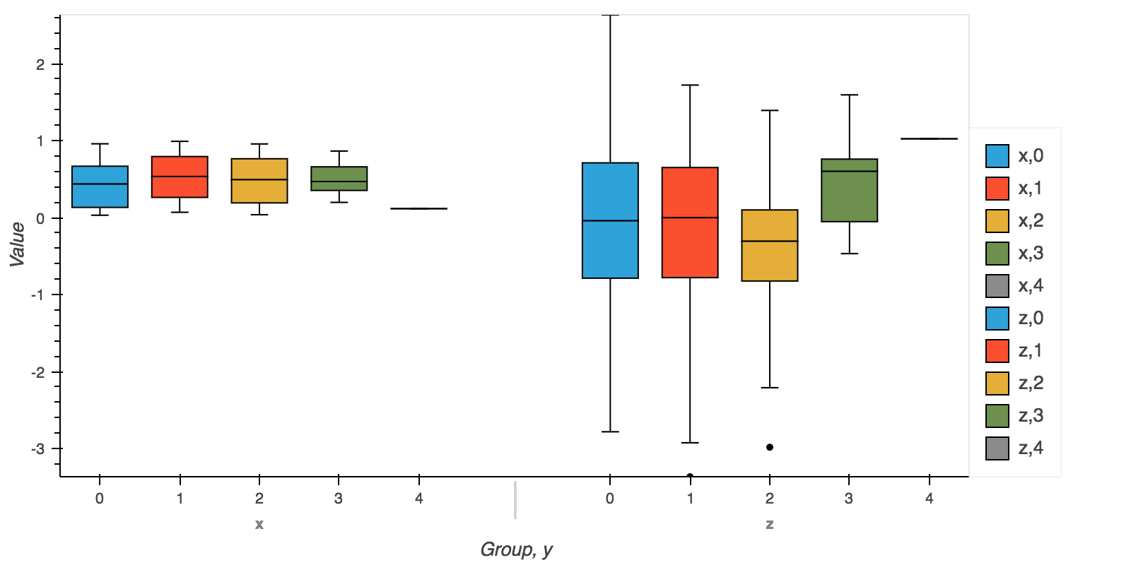
It is also possible to group a box plot by a secondary variable:
df.plot.box(by='y', height=400)
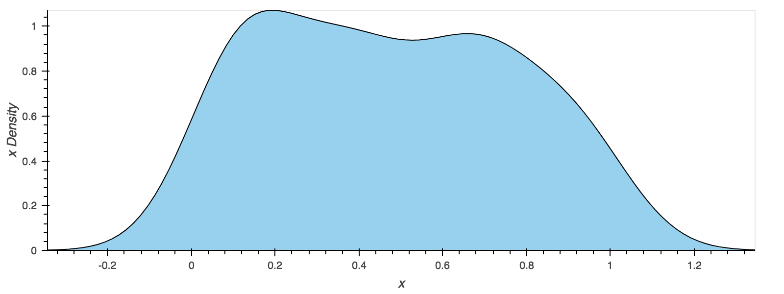
KDE plots
You can create density plots using the Series.plot.kde() and DataFrame.plot.kde() methods.
df.x.plot.kde()
Area plots
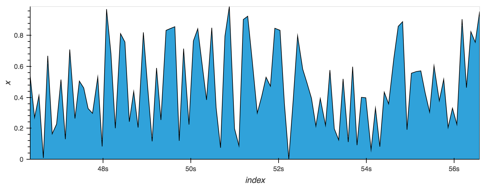
You can create area plots with Series.plot.area() and DataFrame.plot.area(). To produce stacked area plot, each column must be either all positive or all negative values.
df.x.plot.area()
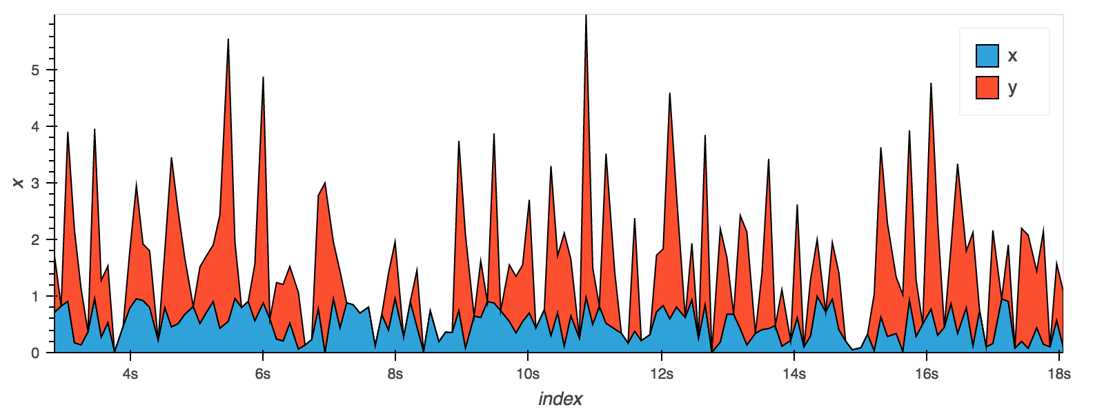
When plotting multiple columns on a DataFrame the areas may be stacked:
df[['x', 'y']].plot.area(stacked=True)
Scatter plots
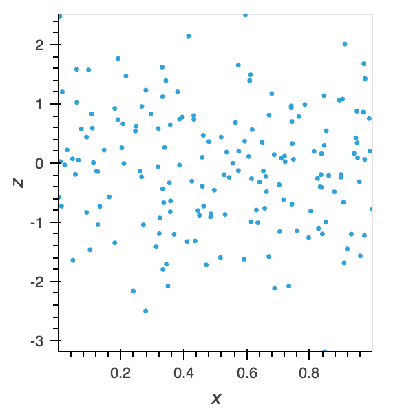
Scatter plot can be drawn by using the DataFrame.plot.scatter() method. Scatter plot requires numeric or datetime columns for x and y axis. These can be specified by x and y keywords each.
df.plot.scatter(x='x', y='z')
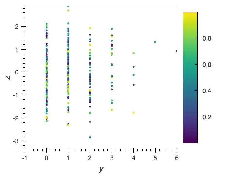
The scatter points can also be colored by a certain column using the c keyword. Additionally we will enable a colorbar and adjust the xaxis by setting x-axis limits using xlim:
df.plot.scatter(x='y', y='z', c='x', cmap='viridis',
                width=400, colorbar=True, xlim=(-1, 6))
Composing Plots
One of the core strengths of HoloViews is the ease of composing
different plots. Individual plots can be composed using the * and
+ operators, which overlay and compose plots into layouts
respectively. For more information on composing objects see the
HoloViews User Guide.
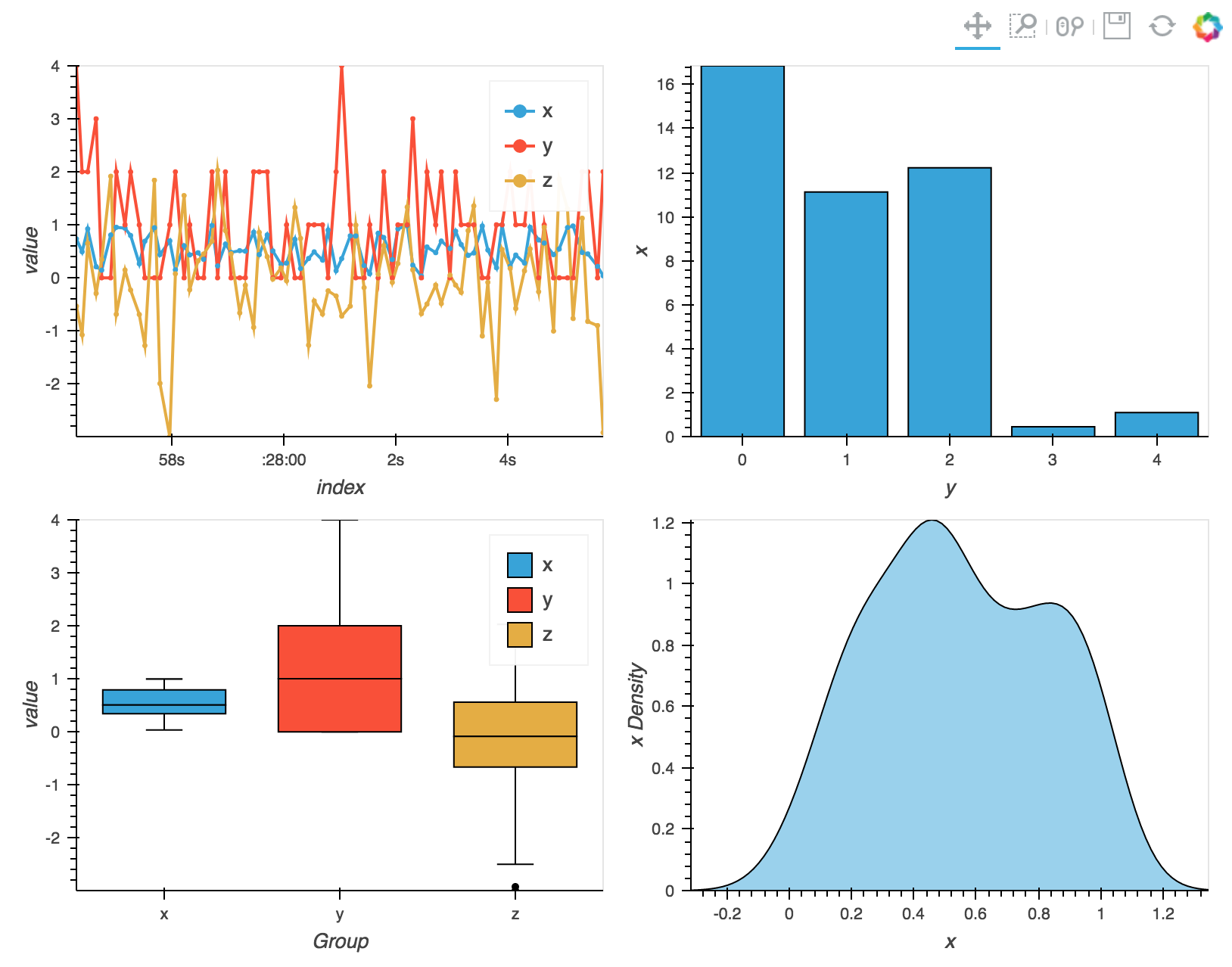
By using these operators we can combine multiple plots into composite Overlay and Layout objects, and lay them out in two columns using the Layout.cols method:
(df.plot.line(width=400) * df.plot.scatter(width=400) +
 df.groupby('y').sum().plot.bar('y', 'x', width=400) +
 df.plot.box(width=400) + df.x.plot.kde(width=400)).cols(2)
Customizing the visualization
In addition to specific options for different plot types the plotting API exposes a number of general options including:
backlog(default=1000): Number of rows of streamed data to accumulate in a buffer and plot at the same timegrid(default=False): Whether to show a gridhover(default=False): Whether to show hover tooltipslegend(default=True): Whether to show a legendlogx/logy(default=False): Enables logarithmic x- and y-axis respectivelyshared_axes(default=False): Whether to link axes between plotstitle(default=’‘): Title for the plotxlim/ylim(default=None): Plot limits of the x- and y-axisxticks/yticks(default=None): Ticks along x- and y-axis specified as an integer, list of ticks postions, or list of tuples of the tick positions and labelswidth(default=800)/height(default=300): The width and height of the plot in pixels
In addition, options can be passed directly to HoloViews providing
greater control over the plots. The options can be provided as
dictionaries via the plot_opts and style_opts keyword
arguments. You can also apply options using the HoloViews API (for
more information see the HoloViews User Guide).
Deployment as bokeh apps
In the Jupyter notebook HoloViews objects will automatically be rendered, but when deploying a plot as a bokeh app it has to be rendered explicitly.
The following examples describes how to set up a streaming DataFrame,
declare some plots, compose them, set up a callback to update the plot
and finally convert the composite plot to a bokeh Document, which can
be served from a script using bokeh serve on the commandline.
import numpy as np
import pandas as pd
import holoviews as hv
from streamz import Stream
from streamz.dataframe import DataFrame
import streamz.dataframe.holoviews

renderer = hv.renderer('bokeh').instance(mode='server')

# Set up streaming DataFrame
stream = Stream()
index = pd.DatetimeIndex([])
example = pd.DataFrame({'x': [], 'y': [], 'z': []},
                       columns=['x', 'y', 'z'], index=)
df = DataFrame(stream, example=example)
cumulative = df.cumsum()[['x', 'z']]

# Declare plots
line = cumulative.plot.line(width=400)
scatter = cumulative.plot.scatter(width=400)
bars = df.groupby('y').sum().plot.bar(width=400)
box = df.plot.box(width=400)
kde = df.x.plot.kde(width=400)

# Compose plots
layout = (line * scatter + bars + box + kde).cols(2)

# Set up callback with streaming data
def emit():
    now = pd.datetime.now()
    delta = np.timedelta64(500, 'ms')
    index = pd.date_range(np.datetime64(now)-delta, now, freq='100ms')
    df = pd.DataFrame({'x': np.random.randn(len(index)),
                       'y': np.random.randint(0, 10, len(index)),
                       'z': np.random.randn(len(index))},
                      columns=['x', 'y', 'z'], index=index)
    stream.emit(df)

# Render layout to bokeh server Document and attach callback
doc = renderer.server_doc(layout)
doc.title = 'Streamz HoloViews based Plotting API Bokeh App Demo'
doc.add_periodic_callback(emit, 500)
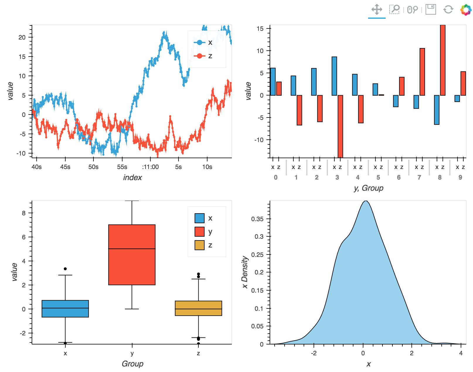
For more details on deploying bokeh apps see the HoloViews User Guide.
Using HoloViews directly
HoloViews includes first class support for streamz DataFrame and Series, for more details see the Streaming Data section in the HoloViews documentation.
